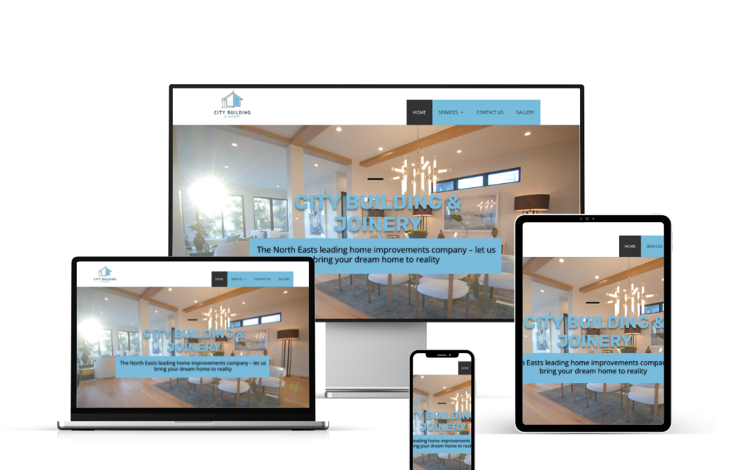
Modern web design is a relative phrase. Some people might think a web designed in 2020 is modern, while others in the web design field have seen so many new things in the past year, that anything pre-2024 is already outdated. The thing we notice most is that modern web design doesn’t require or benefit from a ton of bells and whistles.
How Web Design Affects User Experience
How your visitors perceive and interact with your website can make or break you. User experience (UX) is the overall experience a person has using a product (like your website), especially in terms of how easy or pleasing it is to use. Your web design can affect UX in a few ways:
It Guides the Reader’s Eye Down the Page
A well-designed website will know how to keep the reader scrolling. This often means breaking up content into smaller chunks, including visual hierarchy with banner images, fonts, and supporting elements, and utilizing white space.
It Captures Their Attention
What happens above the fold really does affect the entire user experience. It only takes 0.05 seconds for a visitor to decide whether or not they’ll stick around on your website. Therefore, that first impression counts, and you have to grab their attention! It’s important to include high-quality imagery, and good typography, and to be cohesive in your design. Clutter will only detract a visitor and force them to click out of your site.
It Increases Functionality
How your website functions is also a huge factor in the overall user experience. Responsive web design ensures that your website looks and functions the same no matter what device a visitor is using.
It Promotes Professionalism and Can Build Trust
Outdated and tacky websites won’t cut it anymore. Since 94% of people won’t trust an outdated website, consistently updating and refining your design and content is key to pleasing consumers. A great web design presents your business as professional, clean, and reliable.
10 Elements of Good Modern Web Design
Here are some elements of great web design with examples to help inspire you to create your own beautiful modern web design.
- A Strong, but Limited, Color Palette
A strong color palette helps create cohesiveness between everything your business puts out. Companies with primary and secondary colors have more flexibility when creating new elements for their website. Most modern web designs opt for only two or at most three major design colors to avoid visual distraction. Simplifying the color scheme makes it easier to focus, as seen on sites like Apple and Amazon.
- Plenty of White Space
White space acts as a buffer between all the elements on your page, including copy, sidebar, and margins. It makes for a clean design that is easily digestible and organized. Websites adopting a more minimalistic style benefit from keeping space open to allow readers to navigate with ease.
- Responsive Hero Images
Incorporating high-quality, vivid hero images can attract attention and guide users down the page. For example, HelloFresh’s homepage uses colorful hero images of delicious fresh food to captivate users.
- Valuable Calls to Action
Great calls to action (CTAs) are crucial for converting visitors into leads and customers. CTAs should be strategically placed throughout your website, such as at the end of blog posts, in sidebars, and on your homepage. They help gather contact information to continue conversations with visitors as leads and convert them into customers.
- Cohesive Card Designs
Cards help visitors consume your content more easily by grouping text and imagery together. This creates a simple, organized look while keeping user experience in mind. For example, Help Scout uses cards to create a clean, user-friendly grid design.
- High-Quality Product Videos
Adding product and company feature videos to your website can highlight your brand’s personality and offerings. Videos impact the decision-making process by allowing prospects to quickly understand value. For instance, Fort’s design studio website uses intuitive videos to showcase its products.
- Clean Backend Coding
Clean backend coding is crucial for website functionality. It ensures that your site performs well, loads quickly, and navigates effectively for converting visitors into leads and customers. Dedicating time to clean backend coding makes it easier to maintain and fix any issues that may arise.
- User-Friendly Design
Design your site for the user, not just to boost rankings. User-friendly design should be prioritized over search engine optimization (SEO) initially. Google can tell when users are getting good value from your website because they keep coming back and spending more time on it.
- SEO-Boosting Elements
Modern website design elements can improve SEO, even though they may not be visible to the naked eye. Meta tags, title tags, heading tags, and other HTML coding help your site climb search engine ranks. Optimize these elements to improve your search ranking.
- Speed Optimization
Speed optimization is essential as people expect quick loading times. Slow websites lead to negative perceptions and lost prospects. Optimize photos, enable compression, minimize HTTP requests, and choose proper
hosting options to ensure your website loads quickly and efficiently.
Incorporate these 10 elements into your modern website design. Prioritize user experience, and make sure that you optimize your website for both its physical design and its functionality. Also, consider your mobile site speed, as most people today access websites on mobile devices. A slow mobile site speed will cause higher bounce rates and more exits.
10 Examples of Companies With Good Modern Website Design
Here are 10 companies with the best modern website designs that include many of the awesome elements mentioned above.
- Brit + Co
Brit + Co is a media company that inspires, educates, and entertains real women with a creative spirit. Their website is full of bold yet muted colors and clean lines. They section off their pages well, helping guide the reader’s eye down the page. White space floods in from the sides, ensuring nothing looks cluttered and everything is easy to read.
- Bose
Bose, a well-known audio equipment company, has a website that screams sophistication and functionality. Large hero images are eye-catching and highlight their products perfectly. Bold typography with a lot of visual hierarchy keeps you attentive to the page. The featured products section right under the fold creates a great balance with white space.
- Oak Street Bootmakers
Oak Street Bootmakers’ website is simple and refined. The natural-tone colors are calming to the eye, and the product images are clean and direct. Their homepage, with only three main sections, uses a more creative header and navigation design, enhancing the user experience.
- Londonist Textile Agency
Londonist Textile Agency nails the use of feature videos in modern web design. Their homepage video of an individual looking at design sketches is simple yet engaging. The rest of their homepage combines white space with angular dusty blue elements and image overlaps, creating a bold yet professional look.
- Land Rover
Land Rover USA’s website features beautiful and captivating hero images, including a video. The colors in their images pull you in, while the rest of the site remains clean and simple. The grid-style layout allows for optimal white space, separating vehicle details and specs effectively.
- bthere
The bthere’s website is full of bright colors and animations that keep you engaged. Although the color scheme is busy, it works well because all the colors are cohesive and mesh well together. The moving visual elements entertain visitors while they navigate the site.
- Muse
Muse’s website features awesome product pictures and clean, easy-to-understand copy. They include testimonials on the homepage, with several CTAs strategically placed. The hero image of a woman fastening her headband immediately pulls users in, making them want to learn more about the technology.
- Litter-Robot
Litter-Robot’s website uses plenty of white space and a great color scheme. Their product, a high-tech cat litter pan, is showcased glamorously through pictures and a short product video. Catchy headlines and an engaging layout enhance the overall user experience.
- Tallyfy
Tallyfy’s website is simple and clutter-free. With a single dropdown menu and five CTAs, the site is user-friendly and easy to navigate. A simple illustration demonstrating a workflow adds a visual element without overwhelming the user.
- Absurd Designs
Absurd Designs uses line drawings and artistic illustrations to tell a story whimsically and attractively. Their black-and-white color scheme, combined with plenty of white space, creates an engaging and imaginative website experience.
With these tips and examples, your company can create a kickass website design that will help you attract new visitors, generate leads, and convert prospects into customers.